Verby Nouns: a Jumpy Wall Story
The game
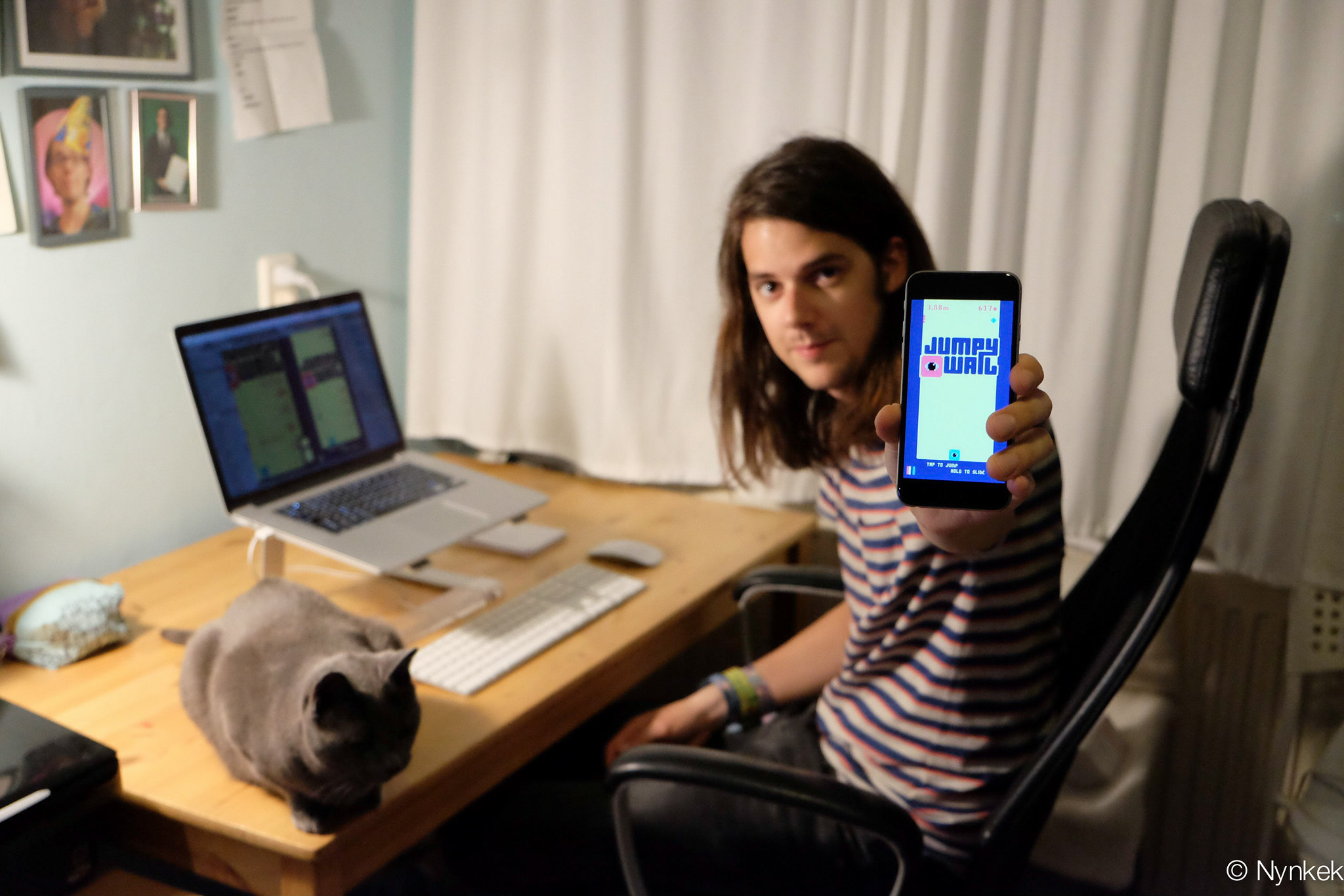
In September 2015 I released my first mobile game. I named it Jumpy Wall, lifting on the already less popular ‘verby noun’ trend for simple and addictive mobiles games, inspired by Flappy Bird and Crossy Road. The game features one-touch controls to wall jump your way up, collecting gems and avoiding obstacles. The scope of the game was deliberately left very small, with the simplest control scheme I could think of: tap to jump, hold down your finger to slowly slide down each wall.

The visuals of the game are the most notable, every time the character on the screen hits a wall the colors for all the elements on screen are randomized. While this may sound disorienting, the simple pixel art style of the game makes all individual elements very recognizable and the changing colors made the gameplay rather iconic.
Trying to emulate the success of Crossy Road I implemented unlockables but with color schemes instead of playable characters. Each of these color schemes could be bought with an in-app purchase or you could try to unlock one randomly by trading in a few collected gems. On specific intervals (following the same pattern used in Crossy Road) you’d get a notification that you got free gems to try to unlock more color schemes, or you could watch an ad every now and then to get a little extra.
Jumpy Wall launched on September 3rd of 2015 with a very brief and small success. It was a first stab at solo game development and I wanted to prove my skills. Next to learning how to develop a game, I also needed to learn to finish a project and release it out into the world. For me personally, Jumpy Wall has been a great success.
How it started
Early 2015 I quit my job to pursue a career in making games. While making games had always been something I hoped I would end up doing, I seemed more intrigued by tech in general and found myself learning iOS development out of sheer interest. The success of some indie games like Fez made me realize that making games as a job could be an option for me. I had the privilege that I could save up enough money to sustain myself for at least 6 months, so I was all ready to dive headfirst into a potentially new career. My plan originally was to build and release one tiny game in one month and in the remaining five months I’d work on a bigger idea. In hindsight unsurprisingly, that tiny game became the bigger idea and it took me almost exactly six months to finish.
While thinking up simple game ideas, I wanted to limit myself with one-touch controls (using your finger anywhere on the screen) and ideally something that did not require making much content. As I’ve always been a fan of the concept of wall jumping (most likely fueled by TowerFall) the idea of an endless wall jumper quickly became a very viable option.
Prototyping
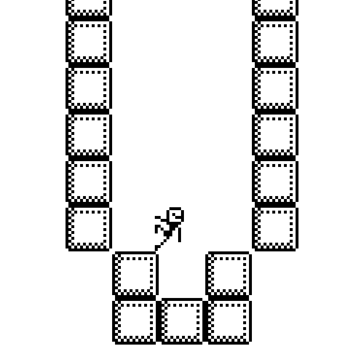
To get somewhere quick, I started the first prototype with pixel art. I drew a generic block and stick figure character that would do the jumping. Of course this character had a sprite for jumping, falling, sliding from either side and standing still on the ground.

From here I could play around with obstacles, controls and tweak the physics to get the gameplay to something enjoyable. With every new iteration I recorded a Vine (RIP) which turned out the be a perfect way to showcase the work in progress.
By minimizing the complexity of the level design, I made it possible for the level to be endless. That would mean I could design a few chunks of level that would be randomly repeated as the character moves up. Now I have a game that has one endless level and thus greatly reduced the scope of the project.
As you can see in the videos, after getting hit by spikes the character falls down. But I broke a bit of expected gameplay by moving the camera down along with it. I’ve always hated the idea of the bottom of the screen being deadly too, as it was just dictated by the camera moving up. So in this game I allowed the character to go back down, and if you got really high, you’d see the character fall all the way back down. Too me that felt way better than letter your character just falling out of the frame with an “oops you’re dead” screen.
The eye
The character needed to have the shape of a square to make platforming the most enjoyable. I wasn’t happy with the generic stick figure so I set out to try something else. Also considering I’m not confident with character design, it needed to be as simple as possible. Eventually the simplest character I could come up with was a square with a huge eye inside. Because it would be just a square, making it squishy would be relatively straightforward, because only the square needed to be scaled in code without the need for any extra images.
Colors
Again being limited by my ability to design environments, I once more tried to simplify the aesthetics of the game by using a limited color palette. I found a free four-color palette online and applied it to the game. Now the eye and gems, the wall, the background, and spikes have their own bright color and suddenly the game looked really appealing.
I wanted to take this one step further and see if it was possible to randomize each color and I quickly came up with this result:
When I was playing with having an event trigger the color change, somebody suggested to have it change on impact with a wall. That was the final missing piece of the puzzle.
To create more color schemes I asked my friend Ron for help. He made (and named) most of the color schemes available in the game today.
The rest
After that, everything was ‘just’ finishing the game. I ended up spending a lot of time into over-engineering some aspects of the project, like how the pixel graphics are rendered and scaled on screen and the dynamic music system that goes faster as you climb higher. I’ll go into these systems in laters posts.
Finally, the less exciting but still very necessary pieces needed to be done: in-app purchases, ads, high-scores and achievements and sharing. And of course the trailer. I might talk more about how this is made with only in-game footage and only editing too.
Final thoughts
I’m really glad I got to spend half a year working only on this little project. Learning Unity, diving deep into systems I’ve never built before (like the dynamic music) and feeling the excitement of actually releasing it too. And now, 5 years later, I feel really proud of what I have accomplished as my first solo project.
If you enjoyed reading this, please let me know! You can tweet at me or email me but please don’t spam me <3